Simple. Cool. Clean. Grey. Flooring.

Simple. Cool. Clean. Grey. Flooring.
1-unit loading grey - hardWear finish

Sunday, October 28, 2012

The space between the lines - concrete floor theory part 2


Surprise.  Our brains squirt dopamine on themselves when we encounter Novelty.  This is part of why:
  • many women will go shopping today.
  • many men will watch football today.
  • I work with concrete.
  • you are browsing the internet now.


The chemicals won't last for long, so we keep looking at new stuff until we have had our fill.
"One question still remains - how much more art can we take" - Fat Mike of NOFX  
Too much though, and we want to go home to Familiarity.  Familiarity puts serotonin into our blood, and is why I felt so delightful riding to Austin after a catfish dinner at the Hill Country Cupboard.   


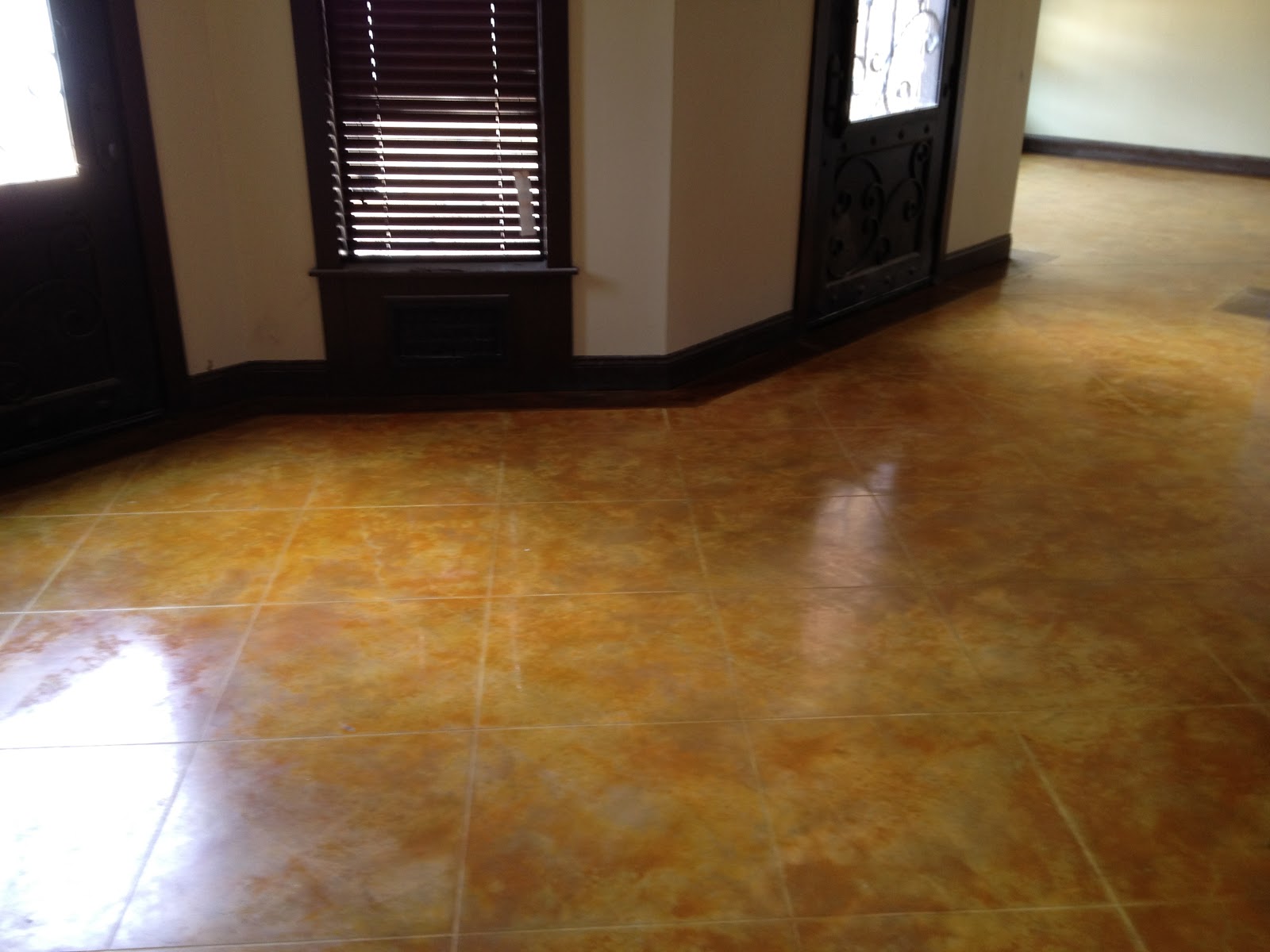
This is also why we love music we grew up on.  Though it may be really great music, at this point the novelty is gone, and we are there listening because it feels like a blanket right out of the dryer.  This is also why we love concrete flooring - the first floors were stained in the 1920's and it hasn't gone out of style yet.  Therefore, I hope/pray/expect much of the work we do to be there when I am long gone.

Good design creates good feelings.  A well designed space balances Novelty+Familiarity well.  Architects and designers work hard to do this in many dimensions (the "bones" that create the spaces, the lines of the furniture, how light is used, etc.).  In contrast, the floor is easy:
More novel finishes demand less patterning to stay appealing.  The photo below was a floor we did in Fredericksburg for a couple with remarkable taste.  Anne selected a color I frankly didn't "get" at first, and she was totally right.  


Less novel finishes with less patterning make great backdrops for bold art and furniture.
The photo below was a floor we did in the Hyde Park neighborhood in Austin.  It was a remodel, and there is some subtle mottling in the floor, but overall we shot for a very muted effect to backdrop her art.


Less novel finishes with no patterning or remarkable art end up making unremarkable spaces.  I don't want to diss anyone by putting up a picture to illustrate this, but chances are you could go out to your garage and see what I mean.

Bold patterns with bold finishes can end up overwhelming.  We made this countertop for a home in the AHBA Parade of Homes 3 years ago, and frankly it was overdone.


Once in a while, it works though.  This floor+countertop was done in 2007 for an art and furniture store in Marble Falls, and everything was turned up all the way and the net result was great:


Thank you for reading. The big idea to take away is balance Novelty with Familiarity.  Take care.

Saturday, October 20, 2012

Concrete meets combinatorics - Concrete floor theory - part 1


The best reason to saw-cut a pattern into a polished concrete floor is to add a layer of craftsmanship and precision to something that is variegated and handmade.  The challenge with this is to make sure your design is timeless.  The whole point with concrete flooring is simple elegance, and so whenever we add a layer, we must design carefully.  We want to pick patterns that are novel enough to be worth doing, but familiar enough to be comfortable.

"Tile patterns", aka grids, are the most common thing then as stained concrete is inherently novel to most, and we are very used to seeing squares in flooring.  With concrete floors, we find the prettiest sizing to be surprisingly big.  23-36" spacing makes the squares big enough to see the movement in the concrete finishing yet small enough to register as a decorative pattern.  Smaller than this doesn't look good:


A more novel pattern, though still familiar enough to be subconsciously pleasing, is a harlequin pattern.  This is just that same grid, but at 60 degrees rather than 90.  The resulting shape is a diamond with 60 and 120 degree angles.  Such a diamond also happens to be what two equilateral triangles would look like stacked.  Non of this geometric explanation is consciously thought of when you look at it, but it is part of what makes it appealing.    


Lastly to be described in Part 1 here is overlapping patterns.  Simple shapes cut to overlap and generate smaller, congruent shapes end up being timelessly appealing.  Here is a overlapping square pattern:
Here's how this all comes together to make something timeless and elegant:
This very imperfect slab had been painted to look like it was acid stained and we were called in when it started flaking off: 

    The overall look before we started evoked exclamations like "meh."

    After grinding it, the amount of rocks shown varied a lot, so a tight overlapping diamond pattern was cut to give that layer of precision we started this blog with.  

    Like we said earlier, scored and stained concrete looks best with bold proportions.  Though this porch totaled less than 300sf, we cut diamonds over 7' long.  Once finished the tight scoring and color separations balance the natural nuances of the slab to make something that is evocative yet really old looking.